This article is part of a series.
Prev: «How To Make a Roguelike: #1 Project Setup Next: How To Make a Roguelike: #3 Generating Random Caves »
Having a skeleton project is nice, but we should do some actual work on our project. Let’s start by creating the basic user interface elements for handling our player’s interactions.
Zircon basics
It is highly recommended at this point to read the Zircon Overview and the Zircon Crash Course to familiarize yourself with Zircon.
If you open the main.kt file in IDEA you’ll see the following code:
package com.example.cavesofzircon

import org.hexworks.zircon.api.ColorThemes
import org.hexworks.zircon.api.Components
import org.hexworks.zircon.api.SwingApplications
import org.hexworks.zircon.api.component.ComponentAlignment
import org.hexworks.zircon.api.screen.Screen

fun main(args: Array<String>) {

    val grid = SwingApplications.startTileGrid() // 1
    val screen = Screen.create(grid)             // 2

    screen.addComponent(                         // 3
        Components.header()
            .withText("Hello, from Caves of Zircon!")
                                                // 4
            .withAlignmentWithin(screen, ComponentAlignment.CENTER)
    )

    screen.theme = ColorThemes.arc()            // 5
    screen.display()                            // 6

}
Note that Zircon uses the Builder Pattern heavily. What you see above with the
Components.header()call is the creation of one. With builders it is customary to use Method Chaining where each function call on a builder will return the builder itself so you can call another method on it.
What happens here is we
- Create a new
Applicationand start rendering aTileGrid. ATileGridis just a 2D grid which containsTiles. In our case we’ll use CP437 Tiles because they are easy to work with. - We create a
Screenfor our grid. AScreenworks like aTileGridbut it also supports adding UI components like buttons, text boxes, and so on. What’s also important to know is that you can attach multipleScreens to a singleTileGridso it is an easy way to navigate between different game screens. Note that only oneScreencan be displayed (use thedisplaymethod to do so) at a given time.Read more about
Screens here. - We add a
Componentto ourScreenwhich is just a simpleHeaderin our case. - We align the
Headercentered within theScreen. - We apply a
ColorThemeto theScreen. Zircon comes with numerous color themes which you can choose from. Take a look at theColorThemesclass to see them. - We display the
Screento make it visible.
The above approach works for really simple applications but when you start to write more complex user interfaces you’ll feel
the need to start using a more robust approach. Luckily Zircon comes with Views which implement the view part
of the Model-View-Controller pattern.
TL;DR: a View is a re-usable class that holds the UI elements and the corresponding UI logic for a specific screen in your app.
Creating our first View
Let’s start using them by replacing our skeleton code with a StartView:
I suggest putting all our
Views in theviewpackage, to keep them organized. In Kotlin all classes, interfaces and objects go to their own file, the same way you do it in Java. If you come from the Python world keep this in mind.
package com.example.cavesofzircon.view

import org.hexworks.zircon.api.ColorThemes
import org.hexworks.zircon.api.ComponentDecorations.box
import org.hexworks.zircon.api.ComponentDecorations.shadow
import org.hexworks.zircon.api.Components
import org.hexworks.zircon.api.component.ComponentAlignment
import org.hexworks.zircon.api.grid.TileGrid
import org.hexworks.zircon.api.view.base.BaseView

class StartView(
    private val grid: TileGrid
) : BaseView(grid, ColorThemes.arc()) {
    init {
        val msg = "Welcome to Caves of Zircon."

        // a text box can hold headers, paragraphs and list items
        // `contentWidth = ` here is a so called keyword parameter
        // using them you can pass parameters not by their order
        // but by their name.
        // this might be familiar for Python programmers
        val header = Components.textBox(contentWidth = msg.length)
            // we add a header
            .addHeader(msg)
            // and a new line
            .addNewLine()
            // and align it to center
            .withAlignmentWithin(screen, ComponentAlignment.CENTER)
            .build() // finally we build the component

        val startButton = Components.button()
            // we align the button to the bottom center of our header
            .withAlignmentAround(header, ComponentAlignment.BOTTOM_CENTER)
            // its text is "Start!"
            .withText("Start!")
            // we want a box and some shadow around it
            .withDecorations(box(), shadow())
            .build()

        // We can add multiple components at once
        screen.addComponents(header, startButton)
    }
}
To create
Views you’ll need to extend theBaseViewclass. This implementation ofViews was inspired by how TornadoFX works.
As you can see a View takes a TileGrid and a ColorTheme as a constructor parameter. In Kotlin defining a constructor is a little different form how it works in Java: class StartView(grid: TileGrid) will create a primary constructor that accepts a TileGrid as a parameter. This is equivalent to writing this:
class StartView constructor(grid: TileGrid)
Calling a parent constructor is similar to calling a method in Java:
BaseView(grid, ColorThemes.arc())
We pass our chosen color theme as the second parameter here. As you can see calling a constructor when extending a class (using the : notation) is syntactically the same as creating a new object.
Views also have lifecycle events:onDockandonUndock. We’ll take a look at these later.
In Kotlin instead of instance initializer blocks ({}) we have the init {} block to initialize an object. In the init{} block of our view we’re going to initialize the Components that will be displayed. You might have noticed that there is no screen symbol in our code…so why is it available? The reason is that BaseView creates a Screen for us in its constructor and we can use it in our init block!
A
Componentis just a text GUI element we can use to display information to the user or enable interaction.
Now, that we have a view, all we have to do is to dock() it. docking is similar to displaying a screen, but for views:
package com.example.cavesofzircon

import com.example.cavesofzircon.view.StartView
import org.hexworks.zircon.api.CP437TilesetResources
import org.hexworks.zircon.api.SwingApplications
import org.hexworks.zircon.api.application.AppConfig

fun main(args: Array<String>) {

    val grid = SwingApplications.startTileGrid(
        // a grid can be configured using the AppConfig builder
        AppConfig.newBuilder()
            // We can choose a tileset that will be used by default
            .withDefaultTileset(CP437TilesetResources.rogueYun16x16())
            .build()
    )
    StartView(grid).dock()
}
Let’s see what we created! In IDEA you should see a green triangle on the left side of your editor:
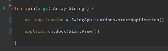
By clicking it you can start up your game. This is very handy during development when you don’t want to constantly rebuild your project from the command line. You should see something like this:
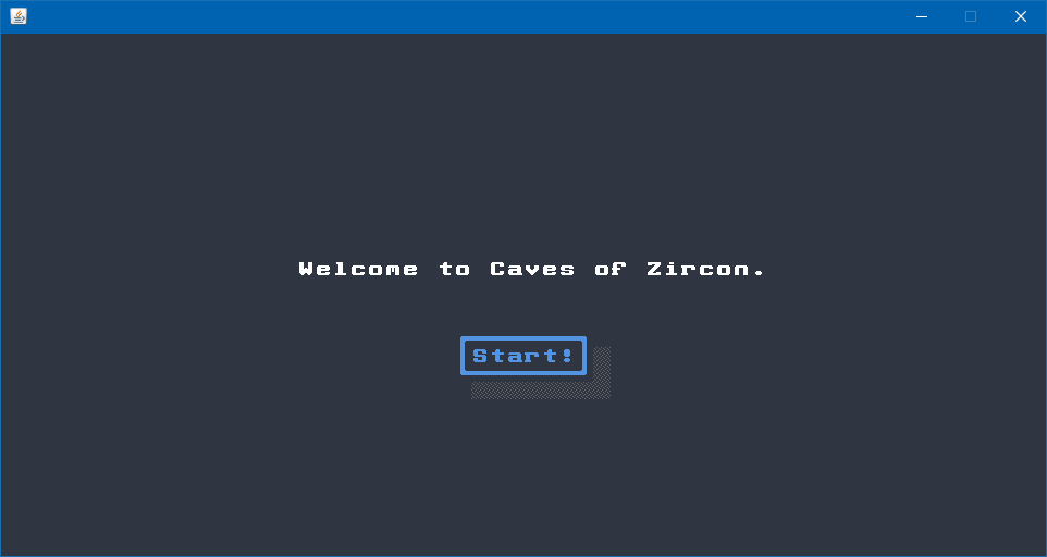
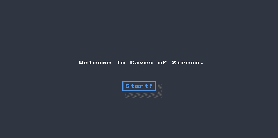
Congratulations! You have created your first View!
Handling user input
Zircon supports handling user input in multiple ways. Luckily it adds this support to Components as well so we can
easily make the Button we added to our View interactive. Let’s navigate to a new PlayView when the player
clicks “Start!”. First we add a new PlayView:
package com.example.cavesofzircon.view

import org.hexworks.zircon.api.ColorThemes
import org.hexworks.zircon.api.ComponentDecorations.box
import org.hexworks.zircon.api.ComponentDecorations.shadow
import org.hexworks.zircon.api.Components
import org.hexworks.zircon.api.component.ComponentAlignment.LEFT_CENTER
import org.hexworks.zircon.api.component.ComponentAlignment.RIGHT_CENTER
import org.hexworks.zircon.api.grid.TileGrid
import org.hexworks.zircon.api.view.base.BaseView

class PlayView(
    private val grid: TileGrid
) : BaseView(grid, ColorThemes.arc()) {
    init {
        val loseButton = Components.button()
            // constants like LEFT_CENTER can also be imported for brevity
            .withAlignmentWithin(screen, LEFT_CENTER)
            .withText("Lose!")
            .withDecorations(box(), shadow())
            .build()

        val winButton = Components.button()
            .withAlignmentWithin(screen, RIGHT_CENTER)
            .withText("Win!")
            .withDecorations(box(), shadow())
            .build()

        // multiple components can be added once
        screen.addComponents(loseButton, winButton)
    }
}
then modify the Button in StartView to navigate to this new View when clicked:
startButton.onActivated {
    replaceWith(PlayView(grid)) // 1
}
What you see here is a lambda which might be a familiar concept from both Python and Java. It is the same as if you would have written:
startButton.onActivated ({
    replaceWith(PlayView(grid))
})
but in Kotlin if the last parameter to a function is a lambda you can skip the parentheses.
What happens here is we
- replace
StartViewwithPlayViewand theStartViewis automatically closed.
You can use the mouse to click these buttons or you can also use the
<Tab>key to focus the next component andShift+Tabto focus the previous one. You can activate a focusedComponentby pressing<Spacebar>.
Let’s start our app and see what it does:
Nice! Let’s add a WinView:
package com.example.cavesofzircon.view

import org.hexworks.zircon.api.ColorThemes
import org.hexworks.zircon.api.ComponentDecorations.box
import org.hexworks.zircon.api.Components
import org.hexworks.zircon.api.component.ComponentAlignment
import org.hexworks.zircon.api.grid.TileGrid
import org.hexworks.zircon.api.view.base.BaseView
import kotlin.system.exitProcess

class WinView(
    private val grid: TileGrid
) : BaseView(grid, ColorThemes.arc()) {

    init {
        val header = Components.header()
            .withText("You won!")
            .withAlignmentWithin(screen, ComponentAlignment.CENTER)
            .build()

        val restartButton = Components.button()
            .withAlignmentAround(header, ComponentAlignment.BOTTOM_LEFT)
            .withText("Restart")
            .withDecorations(box())
            .build()

        val exitButton = Components.button()
            .withAlignmentAround(header, ComponentAlignment.BOTTOM_RIGHT)
            .withText("Quit")
            .withDecorations(box())
            .build()

        restartButton.onActivated {
            replaceWith(PlayView(grid))
        }

        exitButton.onActivated {
            exitProcess(0)
        }

        screen.addComponents(header, restartButton, exitButton)
    }
}
and a LoseView:
package com.example.cavesofzircon.view

import org.hexworks.zircon.api.ColorThemes
import org.hexworks.zircon.api.ComponentDecorations.box
import org.hexworks.zircon.api.Components
import org.hexworks.zircon.api.component.ComponentAlignment
import org.hexworks.zircon.api.grid.TileGrid
import org.hexworks.zircon.api.view.base.BaseView
import kotlin.system.exitProcess

class LoseView(
    private val grid: TileGrid
) : BaseView(grid, ColorThemes.arc()) {

    init {
        val header = Components.header()
            .withText("Game Over")
            .withAlignmentWithin(screen, ComponentAlignment.CENTER)
            .build()

        val restartButton = Components.button()
            .withAlignmentAround(header, ComponentAlignment.BOTTOM_LEFT)
            .withText("Restart")
            .withDecorations(box())
            .build()

        val exitButton = Components.button()
            .withAlignmentAround(header, ComponentAlignment.BOTTOM_RIGHT)
            .withText("Quit")
            .withDecorations(box())
            .build()

        restartButton.onActivated {
            replaceWith(PlayView(grid))
        }

        exitButton.onActivated {
            exitProcess(0)
        }

        screen.addComponents(header, restartButton, exitButton)
    }
}
and wire them together with PlayView:
loseButton.onActivated {
    replaceWith(LoseView(grid))
}

winButton.onActivated {
    replaceWith(WinView(grid))
}
Now you have a working game which you can both win and lose!
At this point you might be wondering why do we have all that duplication in our views and why don’t we do something about it. The good news is that we will! Zircon supports
Fragments that will enable us to extract common patterns into reusable parts.
Conclusion
What we achieved is rather simplistic sure, but every project has to start with setting up the basic building blocks.
We’ve also learned a lot about Views, Components and how the work together to form a UI.
In the next article we’ll start to get our hands real dirty: we’ll add the GameComponent with our own World implementation
that will be able to display the caves we’ll generate by our own hands!
Until then go forth and kode on!
The code of this article can be found in commit #2.